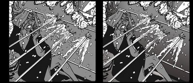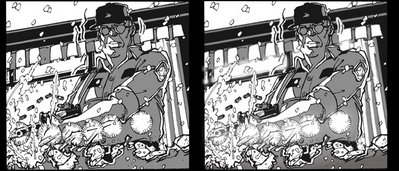

Here's the first samples of "Gestation: Redux."
Not a lot different; just some atmosphere to add depth, the lettering'll be different, and I'm considering a new story / timeline that will include splash pages and full colour to open things up. (At the time I did the book, I kept running into walls trying to come up with an idea and style. So, I put away the fancy pages and funky pens, picked up a spiral sketch book, and just started storyboarding a day with my old pals. I threw in a murder to give it a bit of momentum, and let the "actors" tell ME where to go.)
Unfortunately, one of the problems of this approach, is every. panel. is. the. same. shape. For someone reading a book; it gets a bit tiresome; laying out interesting page compositions is a large part of the process after all! That, and the monochromatic colouring made some sequences, particularly at the end, hard to read visually.
There you have the prodominant reasons for the revisit.